When Edward Hunter and Archie Hughes founded Anglo Engraving in 1898, they wanted to call their company ‘Sun Engraving’ but the name was already in use. It was not until 1911 that the name became available and they were able to register it.
Why Edward Hunter wanted to use the name ‘Sun Engraving’ is not known. His daughter, Eileen, speculated in her book about him that it was because his children were all girls and he wanted a son. This does not seem plausible. Apart from anything else, when he first set his heart on the name in 1898 he had only just completed his apprenticeship and wasn’t married.
It is possible, because the sun is associated with light and time (through the sundial), that he felt the reference would help promote his business. But we think the most likely explanation lies in J.N. Niépce’s coinage of the term heliogravure, in the 1820s, to mean the process of photographic engraving. The word heliogravure, translated literally, means sun engraving. The sun and timeliness are front and centre in the firm’s earliest logos.
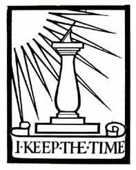
The motif of a sundial with rays behind it was used by Edward Hunter fairly consistently from the moment the name became available to him, although the words beneath the sundial varied. The logo above, with the motto I KEEP THE TIME, appears on a letterhead of 1918. Max Gill was the artist.
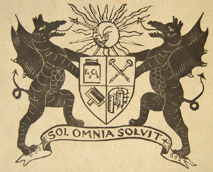
Believe it or not, Sun Engraving had a coat of arms! This whimsical creation appears on the outside back cover of the Christmas 1919 number of Sun Engraving’s promotional publication Illustration. Here, a benign Sun gazes down on a pair of portly black dragons displaying armorial bearings containing a jug of ferric chloride etchant (top left); a pair of gravers, crossed (top right); an inking roller (bottom left) ; and ... what? Does anyone have any suggestions?
The latin motto of the coat of arms, sol omnia solvit, means ‘The Sun solves everything.’
One issue of Illustration, undated but likely published in the late 1920s, featured this proud motif on its back cover. It is possible that every issue boasted a different company motif. We have seen several varients so far.
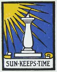
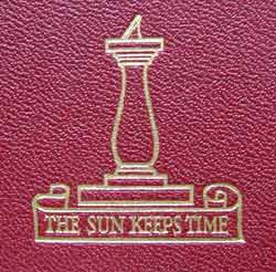
By 1929, when the Sun Compendium was published, the motto I KEEP THE TIME had been changed to SUN KEEPS TIME, or varations thereof. The outside front cover of the Compendium (above) shows a plain sundial, without rays, and THE SUN KEEPS TIME. The endpapers, interestingly, revert to the motto I KEEP THE TIME, but with a plain sundial (and other elements) in a repeat pattern, so the Compendium offers three variations.
On page 44 of the Compendium another logo design appears but perhaps was developed only to demonstrate the difference between Line Work and Half Line Work. It doesn’t seem to have been used anywhere else.
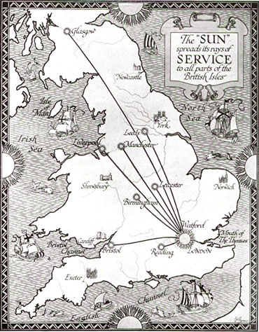
The sun image appeared in all manner of ways in Sun Engraving publicity pieces. This fanciful ‘Sun services’ map, drawn in 1927 by E.G. Perman and used in The Sun Compendium, contains no fewer than thirteen suns among the ships, cathedrals, and sea creatures.
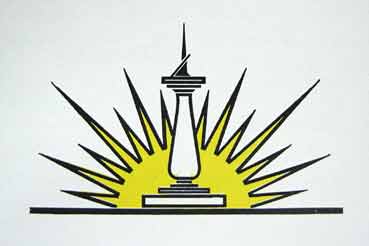
In the splendid Sun Type Book of about 1932/33, the logo appears repeatedly on the pages containing photos of the company’s departments and landscaped grounds. On other pages, the sun and its rays blaze away in all directions as if the company had cut its terrestrial ties and drifted up into the stratosphere.
The sundial reappears – but without a motto this time – on the inside back cover of the outstanding 1938 promotional publication Sungravure Printing Equipment. The look is more contemporary, with the sundial seeming to become one of the sun’s rays.
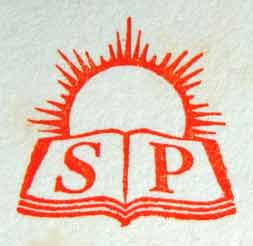
The spin-off of Sun Engraving’s printing operations in 1945, to form Sun Printers, required the adoption of a new look for the new company. Oddly, the new look takes a step back, to a more traditional, rather dated design. Now, the sun rises behind an open magazine on whose pages are printed S and P. (Taken from a ‘With Compliments’ card from the 1950s.)
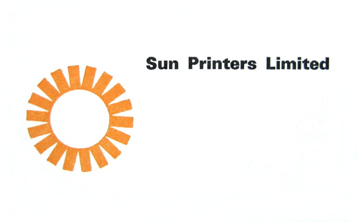
When Sun Printers modernized its look in 1977, the sun motif was designed to double as a gravure cylinder, and the company name was positioned to represent a printed sheet just off the cylinder. (The designer was Paul Yandell, of the Technical Department.) By 1983, though, Sun Printers had been merged with its cross-town rival, Odhams, and the combined companies (called Odhams-Sun) were identified by the BPCC logo of the parent organization – the British Printing and Communications Corporation. In 1989, after a management buyout, the company was renamed BPCC Sun Ltd. A year after that, it was given the cumbersome and eminently forgettable label of BPCC Consumer Magazines (Watford) Ltd. The Sun never shone again on Whippendell Road.
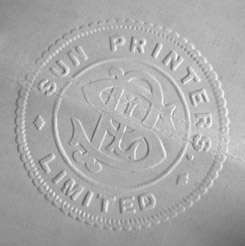
A postscript: Above is Sun Printers’ corporate seal, from Sun letterpress and gravure machine minder Alan Clark’s apprenticeship indenture of 1947.
* * *
If you can shed more light on the evolution of the various logos that carried the Sun name, please contact us. See the ‘About Us’ page to find out how.